Helpshift conversational experiences
Helpshift builds tools for brands to provide great customer support, and conversational experiences are at the heart of this interaction. In 2019, I started re-thinking our approach towards the conversational experiences and setting up a strong design language that would be at par with personal messaging experiences. This was one of the biggest projects I worked on at Helpshift (~ 1 year). I was designing cross-platform (desktop web, mobile web, iOS, and Android native) and it would live inside our customers' apps.
Helpshift . 2019-20
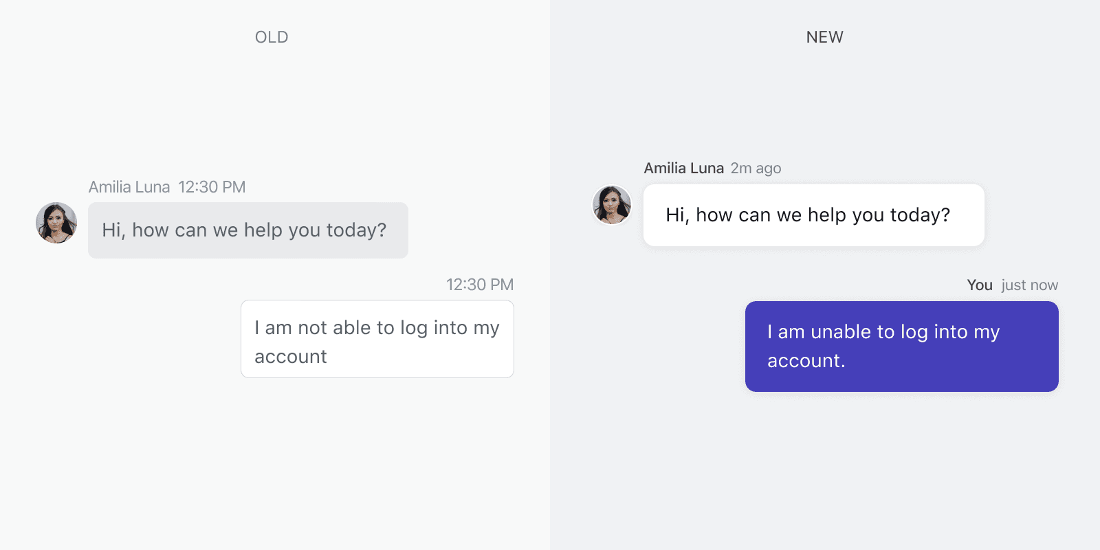
A support conversation is not a sunny day scenario
No one ever really wants to have a support conversation. The user on the other side is already facing some problems. Maybe they need a refund, maybe their order hasn’t arrived, or they are not able to figure something out. That is why they’re reaching out for help.
No one ever really wants to have a support conversation. The user on the other side is already facing some problems. Maybe they need a refund, maybe their order hasn’t arrived, or they are not able to figure something out. That is why they’re reaching out for help.
No one ever really wants to have a support conversation. The user on the other side is already facing some problems. Maybe they need a refund, maybe their order hasn’t arrived, or they are not able to figure something out. That is why they’re reaching out for help.
Keeping this scenario in mind, as designers, it is our responsibility to alleviate user’s stress and to make support conversation a delightful experience. The messaging interface has a huge impact on how the user feels during this interaction with the brand.
Keeping this scenario in mind, as designers, it is our responsibility to alleviate user’s stress and to make support conversation a delightful experience. The messaging interface has a huge impact on how the user feels during this interaction with the brand.
Keeping this scenario in mind, as designers, it is our responsibility to alleviate user’s stress and to make support conversation a delightful experience. The messaging interface has a huge impact on how the user feels during this interaction with the brand.
Problems with the previous version
The previous version of Helpshift's Web Messenger was very functional. It got the job done but when it came to user-experience, it left a lot to be desired.
The previous version of Helpshift's Web Messenger was very functional. It got the job done but when it came to user-experience, it left a lot to be desired.
The previous version of Helpshift's Web Messenger was very functional. It got the job done but when it came to user-experience, it left a lot to be desired.

It was tiny: We were falling into the same tiny box of legacy customer support messengers. We wanted to break away from that. It looked busy and dated: In a tiny box, we were heavily using borders and dull greys. The elements were fighting for space and the overall experience didn't feel delightful. We wanted to push the design to the edge and use the power of space, shape and color to create a sense of calm. No transient states: There were no transient states for sending and receiving messages. There were no animations. Every transition was a hard cut. It didn't play well with mobile: The previous messenger was not designed with mobile in mind. It was somehow made to work on mobile but one could tell that it was an afterthought.
It was tiny: We were falling into the same tiny box of legacy customer support messengers. We wanted to break away from that. It looked busy and dated: In a tiny box, we were heavily using borders and dull greys. The elements were fighting for space and the overall experience didn't feel delightful. We wanted to push the design to the edge and use the power of space, shape and color to create a sense of calm. No transient states: There were no transient states for sending and receiving messages. There were no animations. Every transition was a hard cut. It didn't play well with mobile: The previous messenger was not designed with mobile in mind. It was somehow made to work on mobile but one could tell that it was an afterthought.
It was tiny: We were falling into the same tiny box of legacy customer support messengers. We wanted to break away from that. It looked busy and dated: In a tiny box, we were heavily using borders and dull greys. The elements were fighting for space and the overall experience didn't feel delightful. We wanted to push the design to the edge and use the power of space, shape and color to create a sense of calm. No transient states: There were no transient states for sending and receiving messages. There were no animations. Every transition was a hard cut. It didn't play well with mobile: The previous messenger was not designed with mobile in mind. It was somehow made to work on mobile but one could tell that it was an afterthought.
The Outcome
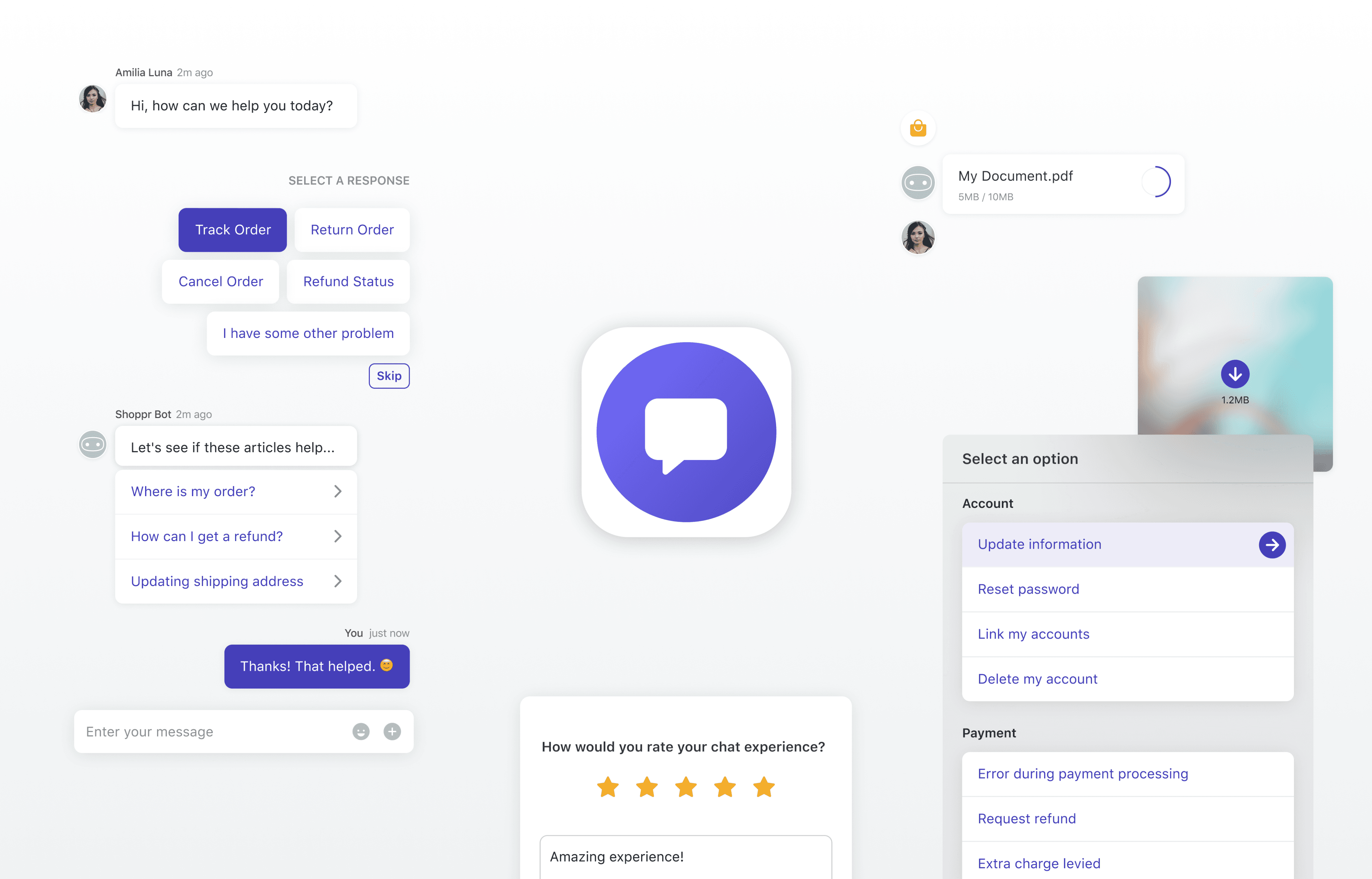
I designed a modern support messaging experience that is consistent across desktop web, mobile web and inside our customers' native apps on iOS and Android.
I designed a modern support messaging experience that is consistent across desktop web, mobile web and inside our customers' native apps on iOS and Android.
I designed a modern support messaging experience that is consistent across desktop web, mobile web and inside our customers' native apps on iOS and Android.
This was achieved by setting up a design system in place to keep the UI elements consistent all across the board. The native elements like the header and the navigation were unique to to each OS so that the user feels at home with familiar interactions.
This was achieved by setting up a design system in place to keep the UI elements consistent all across the board. The native elements like the header and the navigation were unique to to each OS so that the user feels at home with familiar interactions.
This was achieved by setting up a design system in place to keep the UI elements consistent all across the board. The native elements like the header and the navigation were unique to to each OS so that the user feels at home with familiar interactions.

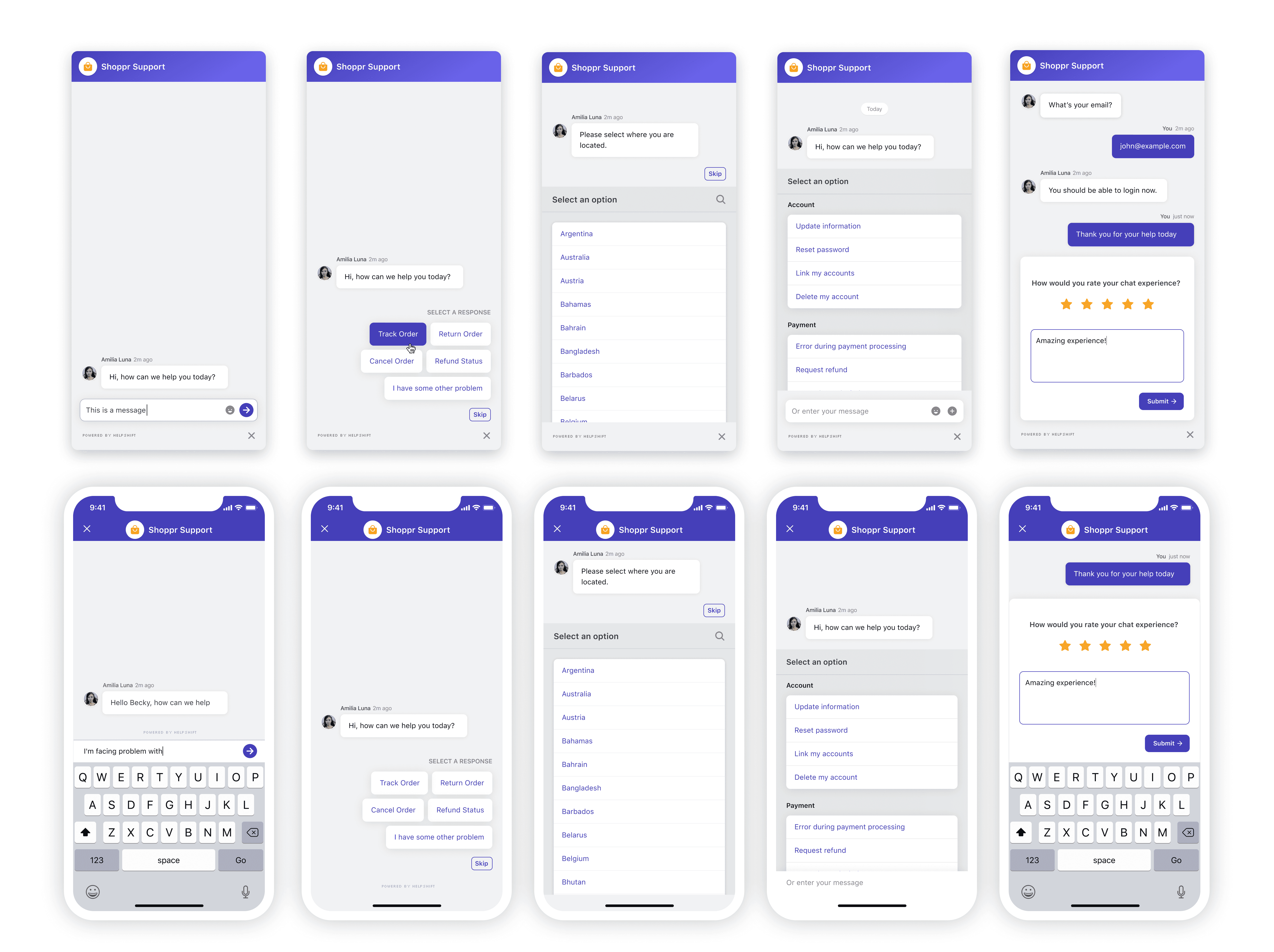
Focus on branding and personalisation
Focus on branding and personalisation
From the very beginning, I focused on crafting an experience that reflects the brand. I was going to live on brands' website or inside their apps after all. Brands can choose an accent color and upload their logo to reflect their personality. Since the accent color is used throughout the UI, the Messenger feels completely different with different accent colors.
From the very beginning, I focused on crafting an experience that reflects the brand. I was going to live on brands' website or inside their apps after all. Brands can choose an accent color and upload their logo to reflect their personality. Since the accent color is used throughout the UI, the Messenger feels completely different with different accent colors.
From the very beginning, I focused on crafting an experience that reflects the brand. I was going to live on brands' website or inside their apps after all. Brands can choose an accent color and upload their logo to reflect their personality. Since the accent color is used throughout the UI, the Messenger feels completely different with different accent colors.

We also introduced support agent avatars in the conversation header and emojis to make the experience feel more personal.
We also introduced support agent avatars in the conversation header and emojis to make the experience feel more personal.
We also introduced support agent avatars in the conversation header and emojis to make the experience feel more personal.

My approach to the re-design
As much as it was an exercise in re-designing the existing messaging experience, it was also an opportunity for me to think how we want to approach designing future experiences. I wanted to craft a modern messaging experience that would work seamlessly on desktop web, mobile web, and inside our customers' native apps on iOS and Android.
As much as it was an exercise in re-designing the existing messaging experience, it was also an opportunity for me to think how we want to approach designing future experiences. I wanted to craft a modern messaging experience that would work seamlessly on desktop web, mobile web, and inside our customers' native apps on iOS and Android.
As much as it was an exercise in re-designing the existing messaging experience, it was also an opportunity for me to think how we want to approach designing future experiences. I wanted to craft a modern messaging experience that would work seamlessly on desktop web, mobile web, and inside our customers' native apps on iOS and Android.
Early ideas and prototypes
I had my work cut-out for me but since I had to start somewhere, I started throwing together initial ideas of what our Web Messenger could look like. These prototypes weren't meant to be perfect. They just gave me a starting point and something to iterate upon.
I had my work cut-out for me but since I had to start somewhere, I started throwing together initial ideas of what our Web Messenger could look like. These prototypes weren't meant to be perfect. They just gave me a starting point and something to iterate upon.
I had my work cut-out for me but since I had to start somewhere, I started throwing together initial ideas of what our Web Messenger could look like. These prototypes weren't meant to be perfect. They just gave me a starting point and something to iterate upon.
Articulating a design language
To direct my design efforts in one direction, I had to crystallise and articulate what I was trying to change. I started to dig deep and define the principles that would guide the process and decision making.
To direct my design efforts in one direction, I had to crystallise and articulate what I was trying to change. I started to dig deep and define the principles that would guide the process and decision making.
To direct my design efforts in one direction, I had to crystallise and articulate what I was trying to change. I started to dig deep and define the principles that would guide the process and decision making.
Crafting better shapes and relationships between them
When I started redesigning the conversational experience, I started to dig into why the old interface felt busy and unpleasant.
When I started redesigning the conversational experience, I started to dig into why the old interface felt busy and unpleasant.
When I started redesigning the conversational experience, I started to dig into why the old interface felt busy and unpleasant.
In the previous version, we were extensively using borders for separating out elements and cascading shapes to group them together. It resulted in the UI appearing very busy and this busyness only compounded the more such elements were placed close to each other.
In the previous version, we were extensively using borders for separating out elements and cascading shapes to group them together. It resulted in the UI appearing very busy and this busyness only compounded the more such elements were placed close to each other.
In the previous version, we were extensively using borders for separating out elements and cascading shapes to group them together. It resulted in the UI appearing very busy and this busyness only compounded the more such elements were placed close to each other.
With the new design, we made a conscious choice to simplify the shapes as much as possible and avoid using borders unless absolutely necessary.
With the new design, we made a conscious choice to simplify the shapes as much as possible and avoid using borders unless absolutely necessary.
With the new design, we made a conscious choice to simplify the shapes as much as possible and avoid using borders unless absolutely necessary.
This shift in thinking about shape and separation can be best described by this abstraction below. Instead of using borders, we started using difference in color and elevation (via subtle shadows) to indicate separation of shapes.
This shift in thinking about shape and separation can be best described by this abstraction below. Instead of using borders, we started using difference in color and elevation (via subtle shadows) to indicate separation of shapes.
This shift in thinking about shape and separation can be best described by this abstraction below. Instead of using borders, we started using difference in color and elevation (via subtle shadows) to indicate separation of shapes.
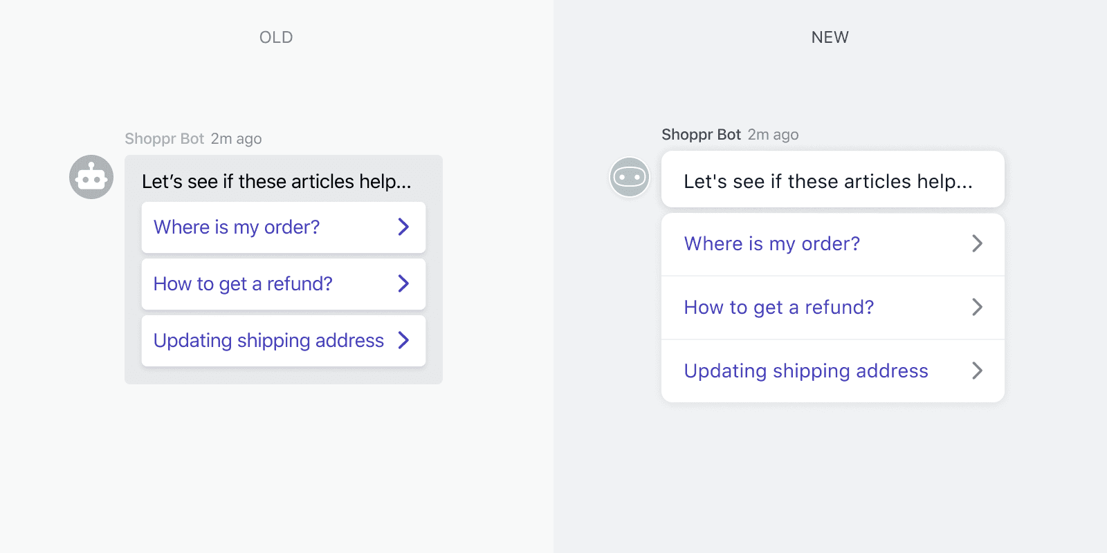
Fixing cascading shapes
When you want to show a hierarchical structure of information, it is very easy to cascade elements to show the parent-child relationship, but it's a very slippery slope. It can very easily make the shapes appear busy. An example of this was FAQ suggestion message bubble in the previous version.
When you want to show a hierarchical structure of information, it is very easy to cascade elements to show the parent-child relationship, but it's a very slippery slope. It can very easily make the shapes appear busy. An example of this was FAQ suggestion message bubble in the previous version.
When you want to show a hierarchical structure of information, it is very easy to cascade elements to show the parent-child relationship, but it's a very slippery slope. It can very easily make the shapes appear busy. An example of this was FAQ suggestion message bubble in the previous version.
I realised that we didn't really need to put these messages in a grey box to show that they're related. I simplified it by de-coupling the suggestions and the accompanying message.
I realised that we didn't really need to put these messages in a grey box to show that they're related. I simplified it by de-coupling the suggestions and the accompanying message.
I realised that we didn't really need to put these messages in a grey box to show that they're related. I simplified it by de-coupling the suggestions and the accompanying message.
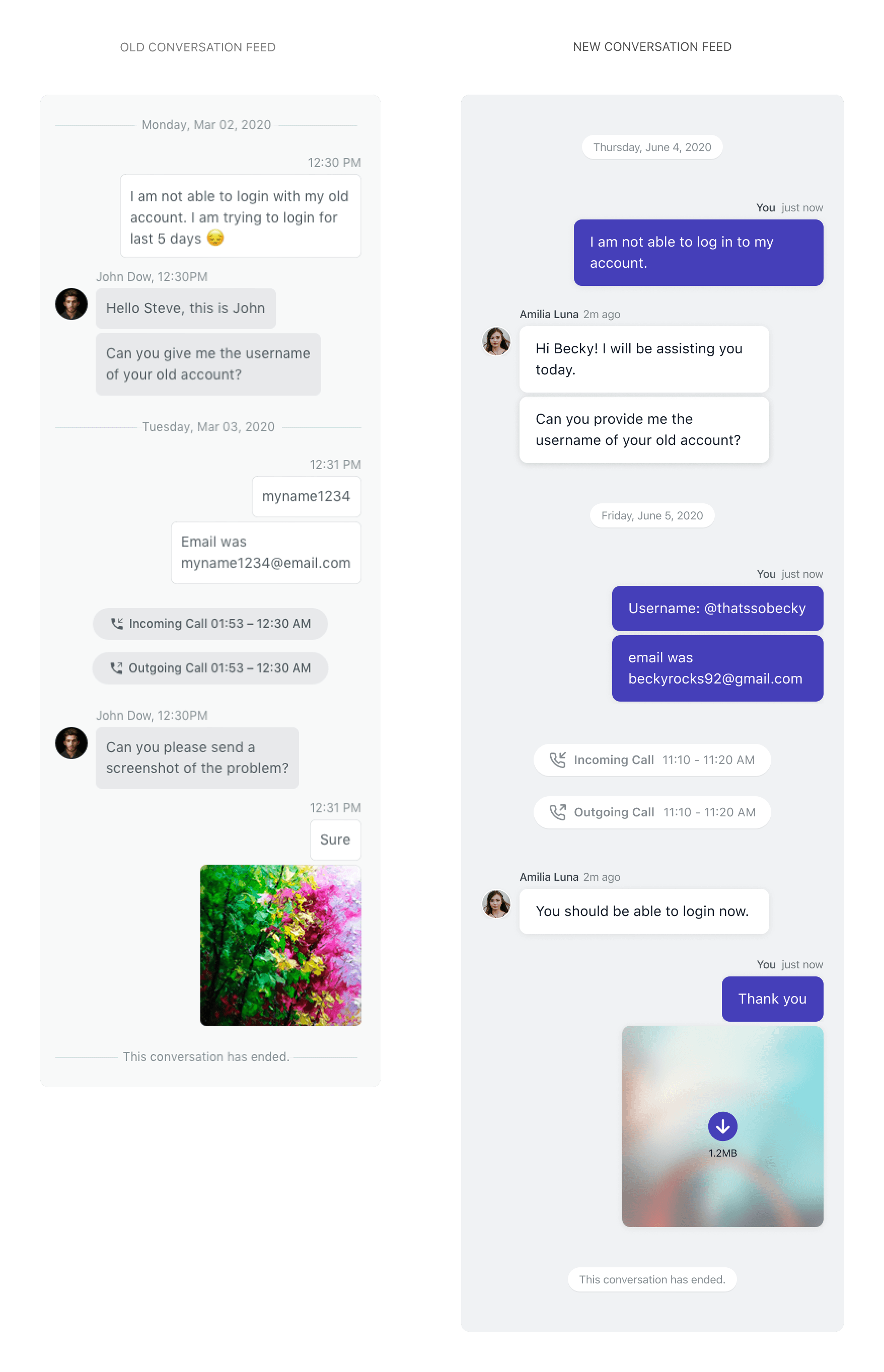
Contrast in message bubbles
In the previous version, the contrast between the support message bubble and the text wasn't great. I changed the support message bubble to a white card. This provided enough contrast between the message bubble and the chat background. At the same time, the visibility of text also improved.
In the previous version, the contrast between the support message bubble and the text wasn't great. I changed the support message bubble to a white card. This provided enough contrast between the message bubble and the chat background. At the same time, the visibility of text also improved.
In the previous version, the contrast between the support message bubble and the text wasn't great. I changed the support message bubble to a white card. This provided enough contrast between the message bubble and the chat background. At the same time, the visibility of text also improved.
I also changed the background color of the user message bubbles to the brand's accent color. This created more contrast with the support message bubbles and made the messenger look more the like brand.
I also changed the background color of the user message bubbles to the brand's accent color. This created more contrast with the support message bubbles and made the messenger look more the like brand.
I also changed the background color of the user message bubbles to the brand's accent color. This created more contrast with the support message bubbles and made the messenger look more the like brand.
Conversation feed
Another important aspect of the conversation experience design was how these different components arranged around each other in the conversation feed. In the old experience, the components was placed quite close to each other which, again, made the interface look busy. I separated out the messages further so that it was easy to glance the messages that were grouped together and the ones that weren't.
Another important aspect of the conversation experience design was how these different components arranged around each other in the conversation feed. In the old experience, the components was placed quite close to each other which, again, made the interface look busy. I separated out the messages further so that it was easy to glance the messages that were grouped together and the ones that weren't.
Another important aspect of the conversation experience design was how these different components arranged around each other in the conversation feed. In the old experience, the components was placed quite close to each other which, again, made the interface look busy. I separated out the messages further so that it was easy to glance the messages that were grouped together and the ones that weren't.
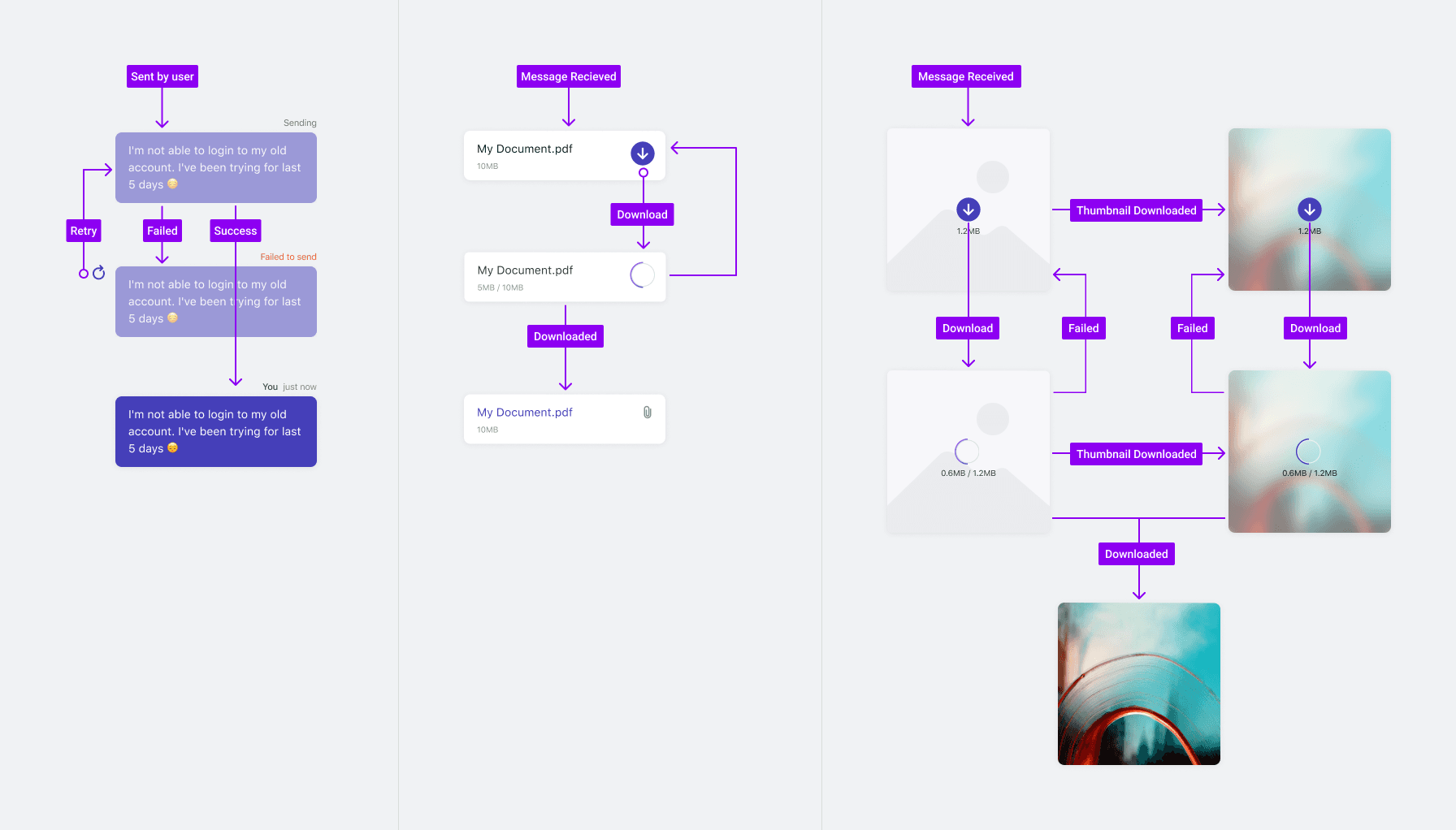
Transient states
We didn't want to leave the user guessing about the what's happening in any interaction. In the previous version, there were no transient states for sending and receiving messages, and downloading of attachments.
We didn't want to leave the user guessing about the what's happening in any interaction. In the previous version, there were no transient states for sending and receiving messages, and downloading of attachments.
We didn't want to leave the user guessing about the what's happening in any interaction. In the previous version, there were no transient states for sending and receiving messages, and downloading of attachments.
User input interactions
I designed a family of user input interactions that seamlessly adapt to a mobile experience.
I designed a family of user input interactions that seamlessly adapt to a mobile experience.
I designed a family of user input interactions that seamlessly adapt to a mobile experience.
A Design System is born
To maintain consistency and ensure efficient design to dev handover, I developed a modular design system based on reusable components and their states, such as message bubble types, reply options, headers, buttons and the likes. Every component can be rearranged and combined with others while maintaining overall design language and recognizable UI patterns for the user.
To maintain consistency and ensure efficient design to dev handover, I developed a modular design system based on reusable components and their states, such as message bubble types, reply options, headers, buttons and the likes. Every component can be rearranged and combined with others while maintaining overall design language and recognizable UI patterns for the user.
To maintain consistency and ensure efficient design to dev handover, I developed a modular design system based on reusable components and their states, such as message bubble types, reply options, headers, buttons and the likes. Every component can be rearranged and combined with others while maintaining overall design language and recognizable UI patterns for the user.

Let's build something together.
Let's build something together.
Let's build something
together.